One touch expenser
expense recording made simple.
Monday, March 4, 2013
Its here. Leaner, meaner and a brand new One touch expenser
Here are some of the awesome new features of the new version:
0. Awesome new main screen. Looks very good. Holo theme throughout.
1. Customizable main screen. You choose what you want to see first.
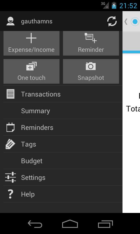
2. Sliding menu for finding stuff easily.
3. Pattern security locking. Finally, you can lock down the app from prying eyes!!
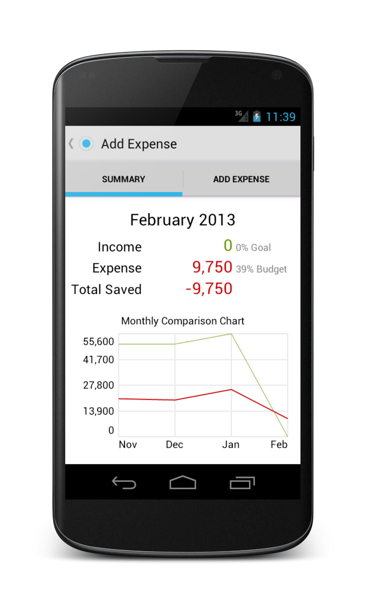
4. Summary page to see your monthly summary at one place and also previous months data.
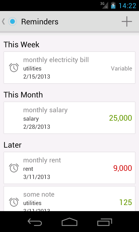
5. Reminders. See what's due within the coming week or the month.
6. Swipe UI. A natural UI for touchscreen. Accomplish majority of tasks by swiping. Swipe for previous or next month in transactions, summary etc.
7. Tidbits which show information to be looked at in the Sliding menu drawer.
8. Resizable widget for Jellybean devices. Need not just be 4*1 for quick actions. Resize and widget shows only as many actions as it can show properly.
9. Rich notifications for Reminders. No more popup when a reminder arrives. A notification and you can indicate paid or not from the notification itself.
10. Enhanced Detailed summary page. Details are now nicely shown.
11. Income and expense seperated in the summary page. Earlier, summary page looked ugly and confusing.
12. Enhanced add transaction and reminder page. No more ugly, confusing, uninspiring design for the add transaction page.
13. Holo theme throughout. The app takes holo light theme to its heart.
14. Consistent coloring throughout. Expense is always red. Income is always green.
15. Enhanced transactions page. No need to do harlem shake with your head to see the full transaction details in the Transactions page. All details showed in the middle.
16. Perfectly follows Android design principles.
17. So many more features in the pipeline. I can't stop getting excited. Are you too?
Regards,
Gautham
Your dear One touch expenser developer.
Saturday, March 2, 2013
Android UI patterns session at Bangalore Android group meetup
Tuesday, February 19, 2013
Long time no see?
Monday, January 7, 2013
One touch expenser at Android App Expo 2013, Bangalore
We had a great privilege of having been invited to Android App Expo at Bangalore. It was an incredible experience to receive appreciation and useful feedback from the delegates, android experts and Googlers. The biggest plus of the expo was the suggestions received from all.
We are very hard at work to implement some of the very good suggestions provided at the Expo and make One touch expenser even more awesome than it already is.
Following improvements are planned for One touch expenser within the next month:
* Password locking.
* Better UI for adding an expense, reminder.
* Customizable widgets.
* Reminders improvements.
* Custom reports while exporting data.
And lot more. Happy new year..
Thursday, December 27, 2012
Optimized for Nexus 7
Though Android tablets adoption has been slow, plethora of affordable tablets flooding have opened new user base for Android tablets. If phone is perfect for recording daily expenses on the go, tablets are perfect for viewing. Tablet UI is all focused on showing the data.
More tablet specific features are coming in the future. Do checkout the app on your tablet and provide us feedback.
Saturday, December 1, 2012
Simpler UI, searching transactions and more.
Version 1.7 was released on Nov 30, with number of enhancements to make the app easier to use and a few bug fixes.
Tags created now on-wards are all in lower case. Multiple tags with same name but different case has been a source of bugs and confusion.
Main page has been simplified to navigate easily. Now, no more two clicks to go to transactions, reminders, adding a transaction etc. Less frequent things are relegated to Settings(Repeating transactions).
Summary page is now so much better and shows both summary of children tags and transactions of the tag.
One exciting enhancement is the ability to search for transactions/transaction. You can search for a transaction either by tag, or note or even amount. And it will instantly find the relevant transactions, and more, it will show the summary of transactions matching the search criteria. Very useful if you want to see how much you spent on a particular item(if you wrote the item in the note or a tag).
Let us know your comments on the enhancements. Also, if there is anything else you want to see in the app.
Friday, October 26, 2012
Version 1.6
There was a minor update(version 1.6.1) pushed out today which fixed a few bugs pointed out by our users. Also, you can now rename tags. Keep sending us feedback.


